2020 Networking Cards
2020 is the year I’ll finally do some networking in San Francisco — well, after COVID-19 is under control, and it’s safe to go out and gather again.
I needed a new card to give out at events, so I opened Illustrator and got to work. The final design is modern, closely aligned with the design of my website, and looks great in print.
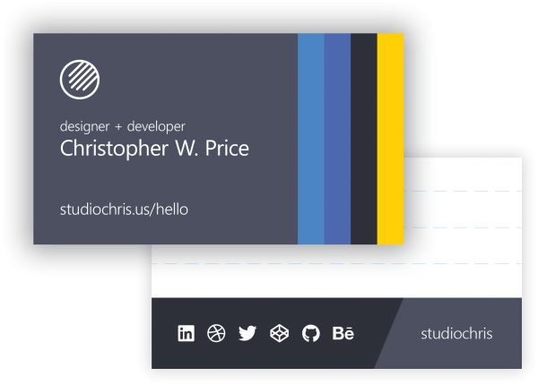
Card Front
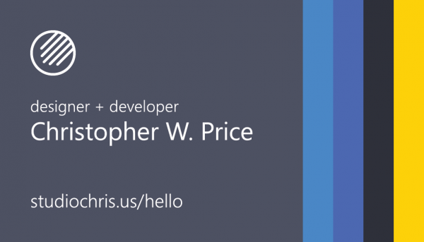
The front of the card matches the branding elements of this site — Segoe UI for type, the primary color, and the inclusion of the themed Palette Ribbon on the right edge (with that perfect pop of yellow leading the eye across the whole design).
I debated a long time about what kind of information to include on the card. I finally settled on a concise description, my formal name, and a URL that links to an introductory site with more information and different ways to reach me. The introductory site’s URL also contains my main domain, so maybe the recipient will stop by here first (and that’s okay too).
Most importantly for the link, it’s not going to change for the foreseeable future, unlike my phone number and preferred email address. The back can always be used to include those specific contact details if needed.
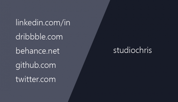
Card Back
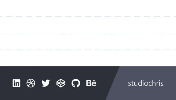
Continuing with contact information, the back of the card has my most relevant social profiles — LinkedIn, Dribbble, Twitter, CodePen, Github, and Behance. Luckily, my username is the same in all of those places so I combined them all and used color blocking with an angled separation (which matches the angle of a forward slash in Segoe UI) to separate the site and my username.
The remainder of the back is ruled with a muted dashed line, with the same approximate spacing as college-ruled notebook paper. The intention was to leave space to write, whether it be a reminder of where we met, what we talked about, email address, phone number, or anything. In cases where nothing is written, it can become a piece of scrap paper for the recipient. I wanted this card to be more than yet another business card. With the blank space, it has the potential to become a useful object instead of just another card taking up space in someone’s wallet or desk drawer.
Printing
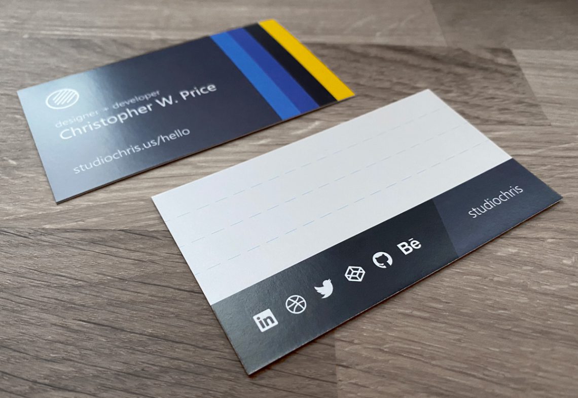
The final card design was printed in process color on 16pt cardstock with a matte coating. A fine Sharpie (my favorite) or ballpoint pen are best for writing on the back. A full glossy UV coating would have looked great, but would have also made them difficult to write on.
For the next batch, I’ll order on 16pt uncoated cardstock for a truly matte finish. Also, while the matte coating can be written on, some inks (and graphite, unfortunately) are prone to smearing. Uncoated stock would allow better ink absorption, which means a faster drying time and less smearing — with pencil writing as a bonus.
Keep reading for some thoughts on the design process.
Process & Design Thinking
Like most projects, the first draft of the design was not the final. It took several iterations to perfect.
Designing the Front

Starting with the front of the card, my initial idea mirrored an exploration I did back in April 2018, only the color bar at the bottom used a single size for the color swatches. The center-aligned logo and text didn’t feel quite right. Overall, this card front felt crowded, and it didn’t align with my website design, which was well underway at the time.
So, I changed everything to match the hero section of my front page. The description was shortened to be more generic. The text and logo were aligned to the left and simplified. And the stripes moved to the right side of the card which give the card a nice left-to-right flow.
And the Back
For the back, I started designing while the card front was still blue. The original idea was to list social profiles with my common username. The beginning of the URL to each of the social profiles was listed on the left, with no trailing slash, with my username on the right. Between the URL start and username is a color separation which matches the angle of a forward slash in Segoe UI. The social URLs were arranged by length to somewhat match the shrinking space formed by the color separation.
I liked the idea of the angled color separation, but worried that the design was too disjointed between the front and back of the card. The back also seemed too plain.

By this point, I had changed the front of the card to the final version using the primary color of my website in the main content section. To unify the back, I added a block of the primary color along with the introduction from the website to the top and moved the social profiles to the bottom edge.
The social profiles were collapsed into icons — thanks FontAwesome Brands — which were arranged for contrast and to be visually pleasing. Dribble and Github were both circles, so they could not be placed next to one another. Also, Dribble and Codepen both used an outlined shape with inner detail, so they didn’t stand out when placed side-by-side. The final arrangement allows all of the logos to shine without being distracted by the others. I changed the order of the social menus on my website to match.
What were the problems with this design?
- Adding the primary color to the top section meant I had to introduce a new color to keep the angled color separation between the social icons and my username. The new color wasn’t on the front of the card, and it was prominent, so it felt out of place.
- The introduction, aside from letting everyone know I prefer to go by Chris informally, could become outdated, which would give the cards an expiration date.
- The idea to leave some unprinted space on the card for flexibility entered my mind.
Onward to the final draft.
Finally, I removed the introduction, and shifted the backgrounds in the social profiles section to colors that were already used on the front of the card.
In place of the introduction, I added subtle ruling to the stark white background to give space for writing custom messages, for instance:
- We met at [event name].
- We talked about [subject].
- Call me! [phone number]
When preparing for an event, cards can be customized ahead of time to give the recipient some context and a reminder of why they have the card and where it came from.
Closing Thoughts
In the end, I’m very happy with the printed cards. They give a nice introduction to my aesthetic and the brand I’m building. When visiting either this site or the intro site listed on the card, there should be no question that the visitor landed in the right place.
They’re also customizable, flexible, and won’t expire prematurely (because I ordered a lot of them).
I look forward to meeting new people in the design and dev community around San Francisco and to be able to give them a card if they want it.
