Elements
The design of this site has a lot of moving parts depending on CSS media query breakpoints. This page catalogs some of the most common elements that appear throughout. Think of it as an abridged style guide or documentation for the design language.
It’s been a life saver for me while building the custom WordPress theme, especially when testing the responsive bits of the design. I’ve also found it useful to make sure the design language is cohesive everywhere on the site. Maybe you’ll find something useful about it too. If you see an element while browsing that you’d like to see added, let me know.
Theme Colors
Double-click a color swatch to copy the color value to your clipboard.
Primary Color Scale
The Primary color is scaled into a gradient of tints and shades using Sass’ scale-color function. The resulting palette is used across the site to achieve color harmony in various design elements.
The pure, original color is in the center at 500. For steps 050 through 450, $lightness is increased by 10% for each step. For steps 550 through 950, $lightness is decreased by 10% for each step.
Steps 000 and 999 are special cases, so they are not computed as pure black or pure white. 000 increases $lightness by 95%. 999 decreases $lightness by 95%.
Headers
H1 – Header Level 1
H2 – Header Level 2
H3 – Header Level 3
H4 – Header Level 4
H5 – Header Level 5
H6 – Header Level 6
H3 – Style: Tutorial Step
For tutorial blog posts, headings use the Tutorial Step style to number each section of the tutorial automatically. Numbering is achieved with CSS’ counter properties.
Tutorial Step 1
Tutorial Step 2
Tutorial Step 3
Paragraph
Plain
Lorem ipsum dolor sit amet, consectetur adipiscing elit, sed do eiusmod tempor incididunt ut labore et dolore magna aliqua. Id neque aliquam vestibulum morbi blandit cursus risus at. Molestie a iaculis at erat. Vitae nunc sed velit dignissim sodales ut eu sem integer.
Sagittis nisl rhoncus mattis rhoncus urna neque. Aliquam malesuada bibendum arcu vitae. At in tellus integer feugiat scelerisque. Aliquet risus feugiat in ante metus dictum at tempor commodo. Ultricies tristique nulla aliquet enim tortor at auctor urna nunc.
This paragraph’s text has a custom color applied. It’s royal blue (accent).
This paragraph has a custom text color and a custom background color.
Style: Featured Link
Open in Current Tab
Open in New Tab
Style: Notice
This is a notice paragraph.
Style: Note
This is a note paragraph.
Style: Footnote
This is a footnote paragraph.
Lists
Ordered List
- Item number one.
- Item number two.
- Nested list item level one.
- Nested list item level one.
- Nested list item level two.
- Nested list item level one.
- Item number three is longer than the others.
- Item number four wraps to a second line. Id neque aliquam vestibulum morbi blandit cursus risus at. Aliquet risus feugiat in ante metus dictum at tempor commodo.
- Item number five is short again.
Unordered List
- Item number one.
- Item number two.
- Nested list item level one.
- Nested list item level one.
- Nested list item level two.
- Nested list item level one.
- Item number three is longer than the others.
- Item number four wraps to a second line. Id neque aliquam vestibulum morbi blandit cursus risus at. Aliquet risus feugiat in ante metus dictum at tempor commodo.
- Item number five is short again.
Style: Footnotes with Ordered List
- This is a footnote.
- This is another footnote.
Style: Footnotes with Unordered List
- This is a footnote.
- This is another footnote.
Code Blocks
Syntax highlighted code blocks make code easier to read.
p, li, table {
  code {
  display: inline-block;
  padding: 0 0.5rem;
  border-radius: 0.25rem;
  background-color: scale-color(#282C34, $lightness: 92.5%);
  color: #282C34;
  }
}Code language: SCSS (scss)<div>This is HTML.</div>Code language: HTML, XML (xml)Groups
Style: Color Band
Color Band Groups span the full width of the post grid and may contain any other type of block. Background and text colors can be chosen through Gutenberg’s Color Settings section of the Block Settings sidebar.
All elements inside the color band are restricted to the center content column of the post grid which has a maximum width of 50rem.
This is a color banded group.
Lorem ipsum dolor sit amet, consectetur adipiscing elit, sed do eiusmod tempor incididunt ut labore et dolore magna aliqua. Id neque aliquam vestibulum morbi blandit cursus risus at. Molestie a iaculis at erat. Vitae nunc sed velit dignissim sodales ut eu sem integer.
- Item number one.
- Item number two.
- Nested list item level one.
- Nested list item level one.
- Nested list item level two.
- Nested list item level one.
- Item number three is longer than the others.
- Item number four wraps to a second line. Id neque aliquam vestibulum morbi blandit cursus risus at. Aliquet risus feugiat in ante metus dictum at tempor commodo.
- Item number five is short again.
Style: Image Band
Image Band Groups span the full width of the post grid and may contain a single image with or without captions. Background and text colors can be chosen through Gutenberg’s Color Settings section of the Block Settings sidebar.
Styling is consistent with Color Band Groups.
Images
Plain without Caption
Plain with Caption
Wide Width Image without Caption
Wide Width Image with Caption
Full Width without Caption

Full Width with Caption
Style: Shadowed
Style: Banded
Image Bands cover the full width of the post grid, breaking the bounds of of the post’s text content. These are shortcuts to achieving the same visual style of Group Image Bands where a custom color is not required.
Two different styles are available: Dark (default) and Light.
Banded without Caption
Banded with Caption
Banded Light without Caption
Banded Light with Caption
Style: Panorama
Panorama without Caption

Panorama with Caption
Galleries
Web Browser Gallery
Websites are viewed in web browsers, so displaying website design screenshots inside a browser frame feels natural. Web Browser Galleries show a mock browser frame with a scrolling viewport, created with HTML and CSS. Images are placed in the viewport and can be switched with several controls (arrows on either side of the browser window, the back and forward buttons in the browser frame, and the paging component below the browser frame).
The browser frame is fixed-height, yet the width and layout is responsive. At small breakpoints, the layout changes to a mobile browser UI.
Interactivity for Web Browser Galleries is driven by Alpine.js.
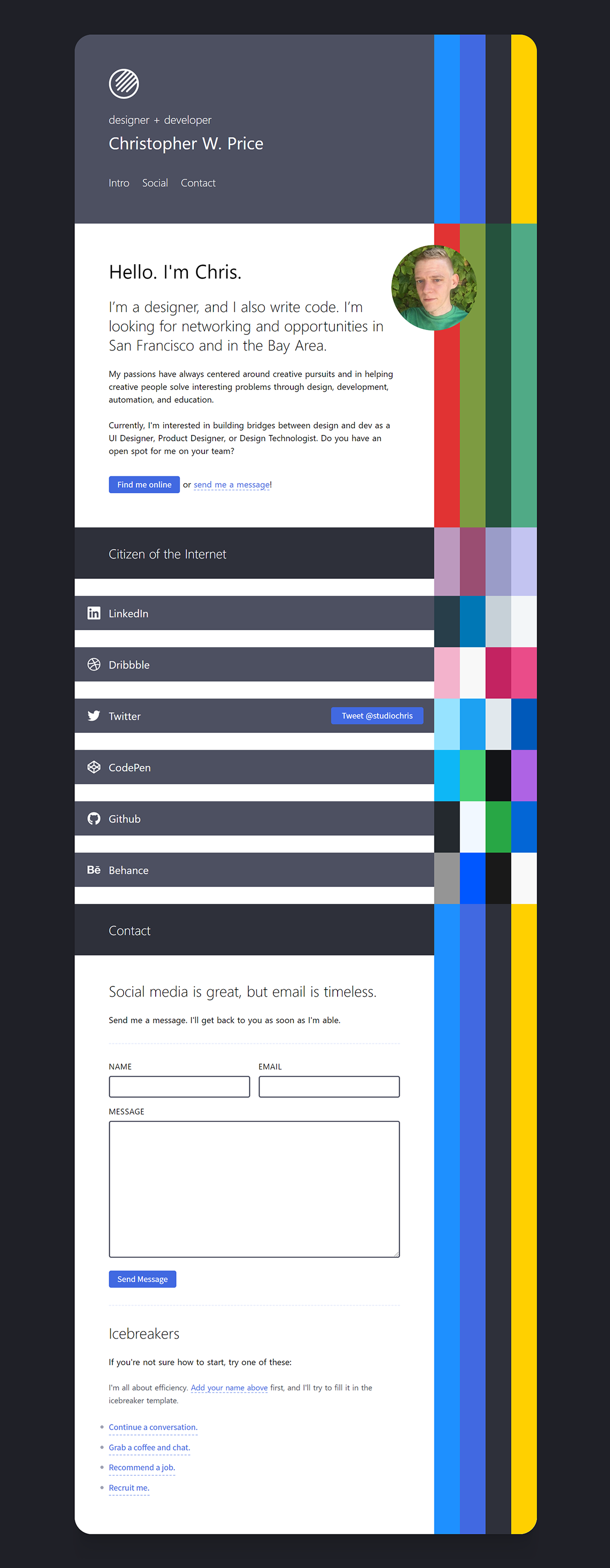
Palette Ribbon
Palette Ribbons add a decorative touch to each content item (pages, blog posts, and projects).
In small layouts, they’re displayed as thin, color-blocked stripes, and as the layout grows, they transform and come together as a striking graphic element along the right edge of the main content column.
Each ribbon’s color scheme is directly influenced by its context and by its content
Ribbon
In large layouts, the Palette Ribbon lines the right edge of the content column adding a splash of content-aware color to the page. In content feeds, they’re stacked one on top of the other to form a striking graphical element.
Double-click any of the individual stripes in a Palette Ribbon to copy the stripe’s color value to your clipboard. Give it a try in the following two samples (or in the Palette Ribbon to the right, if it’s visible).
Static
Static Palette Ribbons are colored with the main theme colors of the site or are manually curated.
Content Matched
Content Matched Palette Ribbons are backed by a full palette of colors, with between four and ten colors in each palette. The colors are derived either from images attached to the content item or manually curated to match some element of the content.
For content items that do not have attached images or selected palettes, the color palette is chosen from a random attachment.
Right-click on a Content Matched Palette Ribbon to shuffle the attached color palette and recolor the four stripes. On mobile, long-press and release to shuffle palettes.
Stripe
On small screens and in the sidebar for large screens, Palette Ribbons are replaced with a thin, non-interactive, color-blocked stripe.
Static Stripe
Content Matched Stripe
Color Palette
Color Palettes contain swatches for each of the colors in a content item’s available palette. They are displayed in the metadata footer of single content items. Color Palettes and Palette Ribbons share the same data sources.
Double-click a color swatch to copy the color value to your clipboard.
Content Matched
Like Content Matched Palette Ribbons, Color Palette swatches are derived either from images attached to the content item or are manually curated to match an element of the content.
While Palette Ribbons show a maximum of four colors at once, Color Palettes show all colors in the attached palette.
Random
When a content item does not have an available attached color palette, a palette is chosen at random, like with Palette Ribbons.
Notifications
For actions that produce no visual artifacts, like copying data to the clipboard, notifications are shown in the lower right corner of the site using a barebones notification system built with Alpine.js.
Notifications slide and fade in from the right edge of the screen when created. As they are dismissed and removed from the screen, they slide left and fade out. All animation is done with performant CSS (using transforms and opacity) with a tiny bit of JavaScript to add and remove classes.
Notifications may have a visible duration (timeout property) and be dismissed automatically at the end of the timeout duration (excluding animation times).
Alternatively, notifications may be “permanent” by having their timeout property set to false. These notifications must be dismissed manually by clicking or tapping the dismiss button on the right side of the notification.
Default Notification
Color Notification
Content Metadata
Content Metadata is shown at the end of posts and projects. It contains the published and updated dates, both of which are important for content that may no longer be useful because of aging (think code snippets for old standards, libraries, and frameworks or tips for outdated versions of software).
Taxonomies and Color Palettes are also in the Content Metadata.
Pages do not normally display Content Metadata. The published and updated dates are accurate for this page. The taxonomies and Color Palette are from a shared random post or project.