Projects

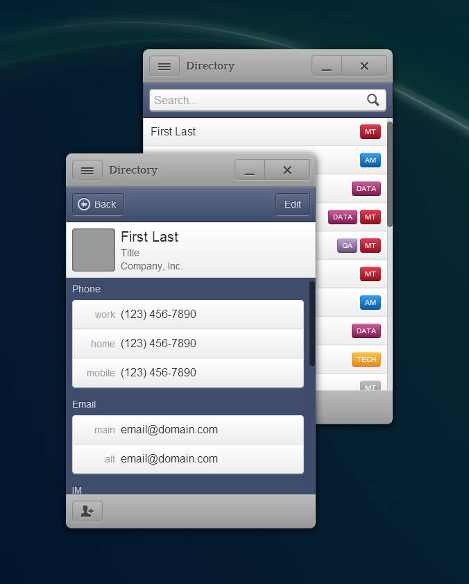
While looking for a replacement for Adobe AIR, Directory was one of my first experiments with AppJS, one of the first available platforms merging Webkit and Node.js into an app development platform.
AppJS is still available for download, but it is no longer maintained. If starting your own project, try Electron or NW.js instead.
The app was meant to be a simple contacts widget, replacing PDF contact lists. The views were modeled after a mobile contacts application with two main views for everyday use — a scrolling list of contacts and a contact detail view. Thanks to AngularJS, the contact list could be filtered live by any of the contact’s properties.
The icons used in this project are Entypo by Daniel Bruce — CC BY-SA 4.0.

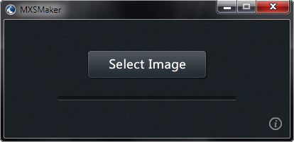
Painter has a few ways of creating color palettes from images whether it be through color sets, the Match Color command or the stylistic coloring achieved through automatic processes such as in the Underpainting panel. Now, add one more: the Mixer panel. With MXSMaker, it is very easy to convert any JPG, PNG or GIF file, with transparency preserved, into a Mixer Pad file that can be loaded directly into the Mixer panel of Painter 8.1 through Painter 12.
MedCharting is a mockup for an EMR companion application made for small tablets like the BlackBerry PlayBook.
Janné loves texture! There isn’t a more appropriate statement in the whole world. Janné’s site was both exciting and scary to work on. When she first contacted me, she had already chosen colors, moods and textures. The fashion equivalent would have been wearing horizontal and vertical strips with polka dots, paisley, three flower prints and a Sunday hat.
Okay, maybe that last bit was a bit extreme, but there was a lot going on in the initial mood board and the final design does include paisley! It was a challenge to keep everything balanced without the texture totally taking over. In the end, I believe we achieved a good balance while keeping the majority of Janné’s textures. We split them up into each of her sections so they don’t all hit the viewer at once.
The final product is stunning. It fits Janné and she loves it. She commented in a phone conversation that everybody she’s shown it to has loved it too. I’d say that’s a job well done.
Scott Deardorff is probably best-known for his Photoshop smudge painting technique. After a wildly successful year sold out sessions of Smudge Painting in Photoshop at Digital Art Academy, Scott created two DVD-based video courses to help keep up with demand – the Mastering the Digital Canvas series.
To distribute his DVDs, Scott needed a website that he could update easily with future products and services and that had e-commerce functionality. E-commerce software is complicated and often difficult to manage. Based on some prior research I had done for my own site, I decided to take the usual WordPress site another step forward and add a customized shopping cart.
The custom shopping cart worked out very well. Being created totally from scratch, except the underlying framework, Scott and I could work together to create product pages that weren’t bogged down by the usual clutter of e-commerce packages. The result is simple, clean, very elegant and easy to use both for Scott and his customers.
