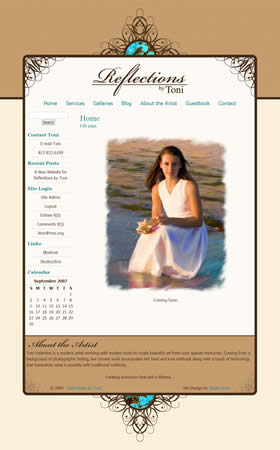
Client Web Site Launch: Reflections by Toni

It’s that time once again. Another successful client site launch. Reflections by Toni, owned by Toni Valentine, offers portrait painting and photography services. Her work is timeless and classy, and as such, she wanted a website design that would convey those same feelings.
She admitted to me that she likes “cutesy” and whimsical, and she usually adds these elements to her clients’ proofs in the form of borders. As a result, we moved in that direction for her site by exploring custom made borders to use for the site that would effectively become branding elements for her Reflections by Toni brand. The main website border is the result of our efforts. It combines whimsical swirls presented in an elegant, symmetrical fashion with a touch of color in the turquoise accents that pull in some common colors from her paintings. The final result is a website that has an elegant look and complements her work flawlessly. Also included in her package was a set of borders specifically for use on her client’s proofs. By combining the site and these brand-new custom borders, the Reflections by Toni brand will surely begin to manifest itself in her clients’ and potential clients’ minds.
On another note, not related to the design, Toni had concerns of being totally in control of her own website, without having to spend hours and hours to update content or have to worry about the design or coding of newly created pages. Of course, I had an answer to that! Toni is set up on an adapted content management system that keeps everything super simple for her to control and update, and not have to worry about the design aspect because it has already been done! Keep your eye on the Studio|chris Shop for these setups to become available in the coming days. Until next time – back to designing!