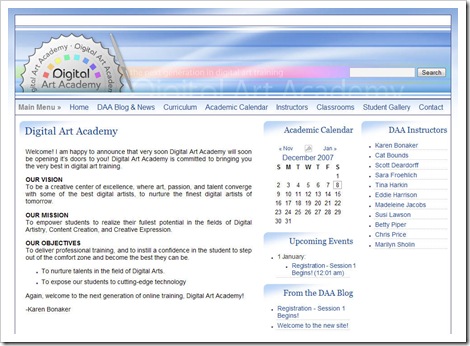
Client Web Site Launch: Digital Art Academy

Digital Art Academy (DAA) is set to be the next generation in digital art training. I was contacted by the owner of DAA, Karen Bonaker, very early in its life with an invitation to become one of the original instructors. As noted in my previous DAA post, I will be teaching the Adobe Illustrator courses at DAA with the first session (and course level, Illustrator I) opening for registration on January 18, 2008 with the first day of class being February 18, 2008. With each successive session, another level of Illustrator will be added until four levels are available. All four of these core courses will be offered as 4-week sessions and cost $32 per session. Also, in the mix are a couple of Creative Illustrator courses that will focus on specific disciplines with using Illustrator as well as Electives that present very specialized training and even more creative avenues. Now, on to the website!
The site itself is composed of a lot of different environments unified by common design elements. For each of the different environments to complete the academy (front end site, blog, and learning management system and forum), it was very important to maintain a consistent look and feel throughout. The typography and graphics from the front-end site were used and flow throughout all of the different environments to maintain and establish the original branding for Digital Art Academy. The final overall feel is soothing and dynamic at the same time with cool blues sweeping through the header and site with punches of color in the custom, versatile logo.
The idea of the site was to create a site with a professional presence along with little bits of creativity sprinkled in to keep the site fun. Finding the delicate balance of professional and widely appreciable and fun and creative was a little difficult to achieve in the beginning of the project because the original logo had a really digital feel using a pixelated font. At Karen’s request, the logo was changed to include the smooth, fluid font it holds now. I believe it helps soften the site as a whole, and in the end, the design is something both Karen and I are extremely happy with.
For now, the site has been released to the staff of DAA to fill in the remaining content, but do go have a look. The course offerings will be awesome and varied with some of the most talented instructors in the field of digital art. I look forward to seeing you all there!