Digital Art Academy for Windows 8
Windows 8, the newest incarnation of Microsoft Windows, will officially be released to the masses on October 26, 2012. For those unfamiliar with the new operating system, Windows 8 is a reimagining of Windows and comes with a brand new user interface, Metro Modern UI that is, in Microsoft’s terms, “fast and fluid” and “authentically digital.” It is the first time Windows has seen a major redesign since Windows 95, and it is MAJOR! Check out this video to see a preview:
Ahead of the Windows 8 release, Ratio Interactive, a design agency in Seattle, WA launched a design contest for Windows 8 apps. It gave me the perfect excuse to begin exploring the design possibilities of the new operating system. For my entry, I chose to design an app for Digital Art Academy.
For those interested, in another post I’ll talk about some of the steps taken and decision-making processes through the design process. For now, though, here’s the final result:
Live Tiles for the Start Screen
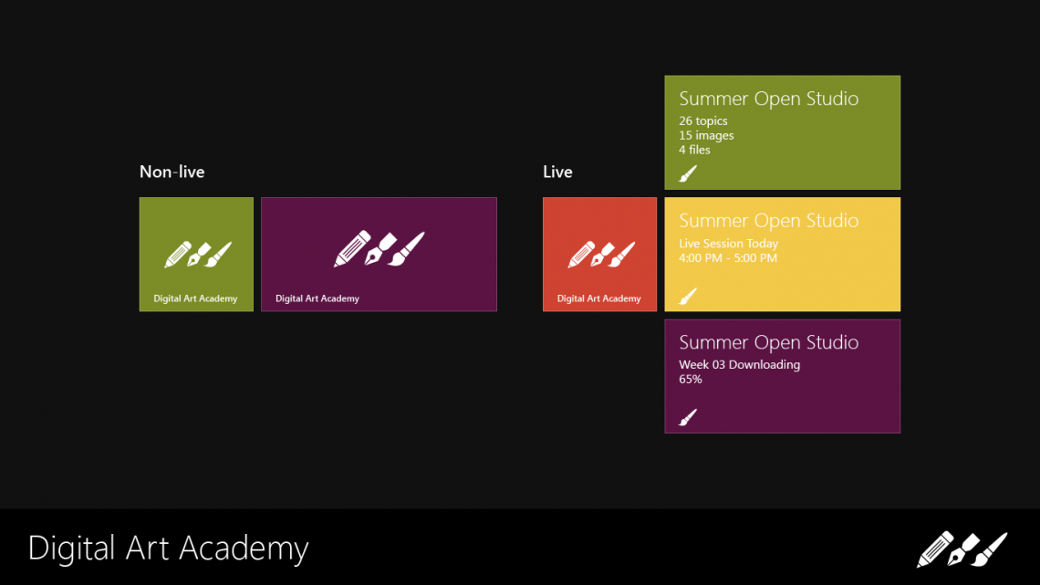
The tiles for the Start Screen are minimal in appearance using simply a background color and icon to identify the app. They are available in two variations, both in two sizes:
- Non-live tiles for those that may choose to opt out of live tiles. They show only an icon and name on a solid background as described above.
- Live tiles, which are the default for Windows 8, that show the app icon and various other useful information from the app right on the Start Screen. As shown in the screenshot, the DAA tiles may show new activity in an enrolled course, reminders for Live Sessions or information related to course download activity.
Splash Screen: Stage 1
DAA’s splash screen, shown while the app is loading, mirrors the view from the tiles from the Start screen.
Splash Screen: Stage 2
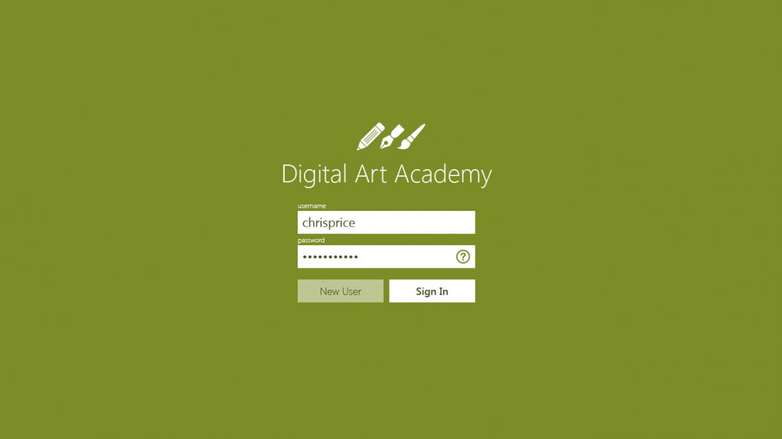
Once loaded, the splash screen animates to show the DAA login form. Logging in is required for students to access their own personal dashboard and to allow access to their enrolled courses. New users may access the app in Guest mode or create an account from this screen as well. Of course, Guest mode users will need to sign in officially to take part in DAA courses.
Home Screen
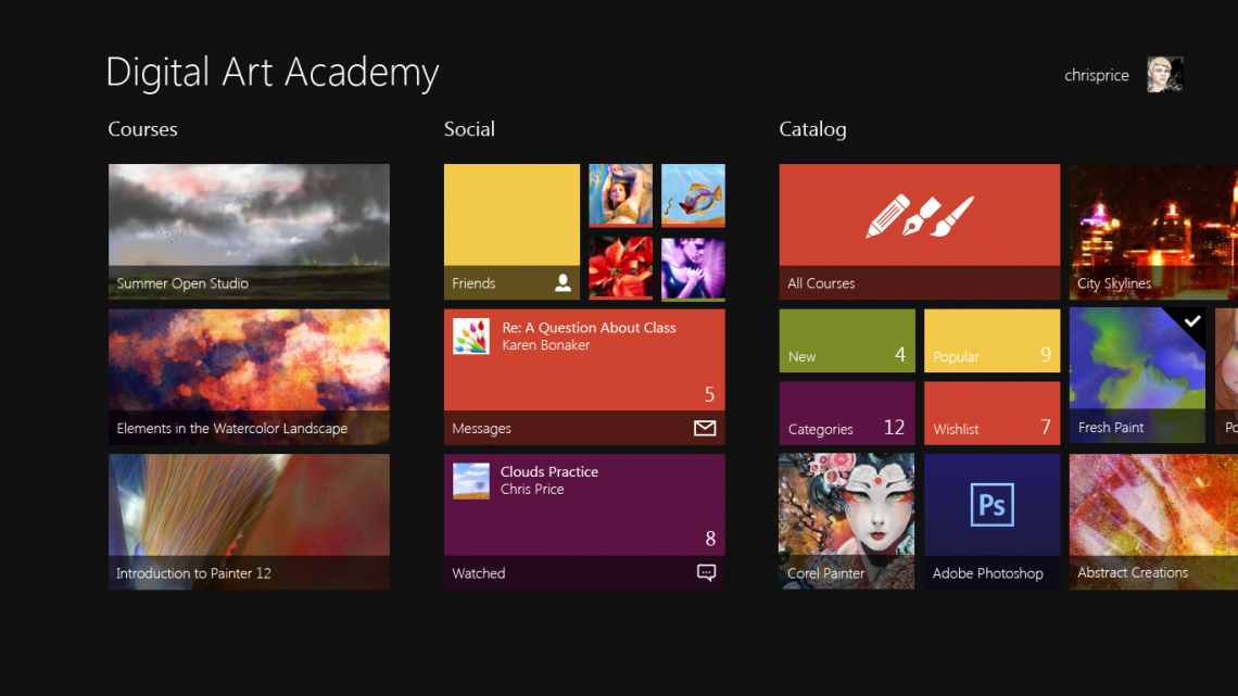
Once logged in, users are taken to the Home screen, which is the main portal for the entire app, much like the Start screen is the main portal for Windows 8. It is broken into several groups that cover all of the main destinations in the app.
Courses
The Courses group contains all of the student’s classes that are currently in session and active. The tiles may show either a poster image or slideshow for the course or an alternative live tile that is similar to the main app tile shown on the Start Screen, only with information dedicated to the specific course being represented.
Social
In the Social group, students will find their Friends list along with user-customizable tiles, complete with online indicators, that link directly to their friends’ profiles. Private messages and watched forum topics are also included.
Catalog
The Catalog group is the gateway to the entire DAA Course Catalog. Along with access to All Courses, live tiles are shown for specific categories and groupings and allow the student to browse quickly. The Wishlist feature of the Catalog is also front-and-center and allows students to add courses that they would like to participate in later. Being an official Corel Training Partner, of course Corel Painter courses are very easily accessible through a category tile. The remaining tiles in the Catalog group are for featured courses.
History
While not visible, the History group allows students to browse a snapshot of course content from classes that have completed in a familiar format.
Course Enrollment Screen
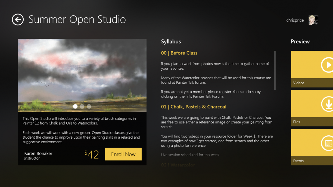
Accessed from the Catalog, the Course Enrollment screen gives a basic description of the course along with a slideshow of images used to demonstrate the techniques taught in the class as well as other helpful info that may help the student decide whether or not the course is a good fit for their needs. As shown the other info may include a short syllabus for the course as well as a preview of course materials and events.
The background used in this screen and other course-specific screens is chosen by the instructor during course creation. The app analyzes the background and chooses a complementary color for UI elements. In this case, the background is the image shown in the slider and a rich golden yellow was chosen as the complementary color.
For consistency and clarity throughout the app, when shown with user interface elements, the background is blurred and covered by a dark overlay. While it fades to the back, as a background should, the color mixing between the overlay and image establishes depth and helps the overall UI environment from feeling flat and boring.
Classroom Overview Screen
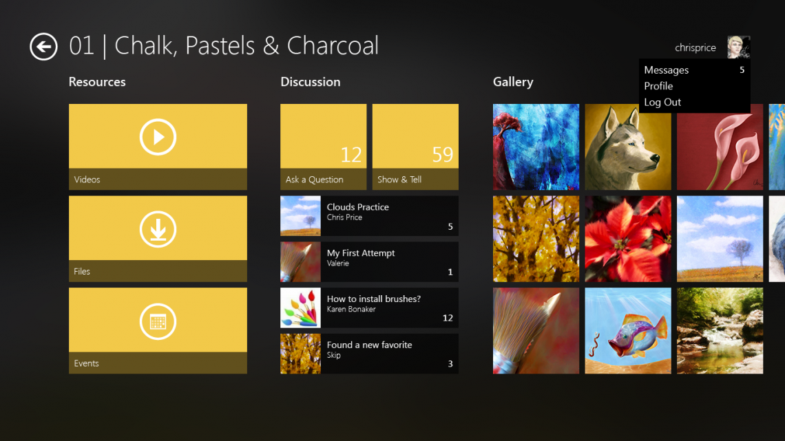
The main classroom remains simple and easy to navigate by showing only one week of course materials at a time. This view also shows the context menu for the student’s avatar with options to view private messages, edit/view their profile and log out of the app.
Resources
The course materials are front and center in the Resources group. They are organized by type, pre-downloaded where available and cached for ease and speed of access.
Videos are downloaded and play in the app itself. Finding a proper player has been a problem for students in the past, so the built-in player removes one of the pain points of the current web experience.
Since Files are usually reference photos, sketches and brush files, during the download stage, they are saved to the student’s Documents library so they are easy to access in their digital painting software. PDF lessons may be viewed and commented on in the app with forum integration or through external apps like Adobe Reader or the new Reader app in Windows 8.
Events, usually webinars and live sessions, are coordinated through online conferencing and display through an in-app browser, so the student doesn’t have to open a dedicated web browser to register or participate. Of course, webinars may also be accessed through external web browsers.
Discussion
The weekly forums occupy the Discussion group. The two main forums available in each week of a DAA class are for asking questions and discussing the weekly assignments and related content. Each forum has a live tile indicating the unread counts since the last visit. Under the main love tiles are secondary tiles for popular or watched topics with new replies.
Gallery
The Gallery group gathers all of the images posted by the students in the weekly Show & Tell forum into an easy to browse wall of images. Students have requested a feature like this many times in the past. While the current platform isn’t particularly well-suited for the feature, the underlying platform and API necessary to build the DAA app would make it very easy to construct. Gallery tiles would also allow access to the original forum posting for another way to browse the weekly Show & Tell forum.
Nav Bar for the Weekly Classroom Overview
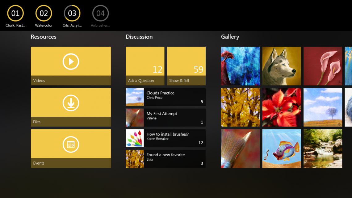
Original concepts for the app had a screen dedicated to switching between the weeks with some secondary content. In the final concept, the entire screen was replaced with a nav bar that removes a step in accessing course materials. Students are always returned to the last week they viewed when entering the classroom, or the new week when it becomes available for the first time.
The buttons in the nav bar show the status of each week, much like live tiles would in a conventional screen. In this view, the week 04 is locked and unavailable to students, so it is showing a disabled state. At the proper time, the week will unlock and be accessible with its button becoming fully opaque.
The ring around the week numbers, in addition to matching the styling of Windows 8 navigation and buttons, shows the download status for the course materials in the week. Week 03, in this case, is currently being downloaded and is approximately 65% complete. Weeks 01 and 02 are fully downloaded.
While not designed for the contest entry, and perhaps unconventional since the weeks cannot simply be scrolled into view with a single finger gesture, Windows 8’s Semantic Zoom feature from the Weekly Overview could be used as another way to switch between weeks.
Weekly Forum Topics Screen
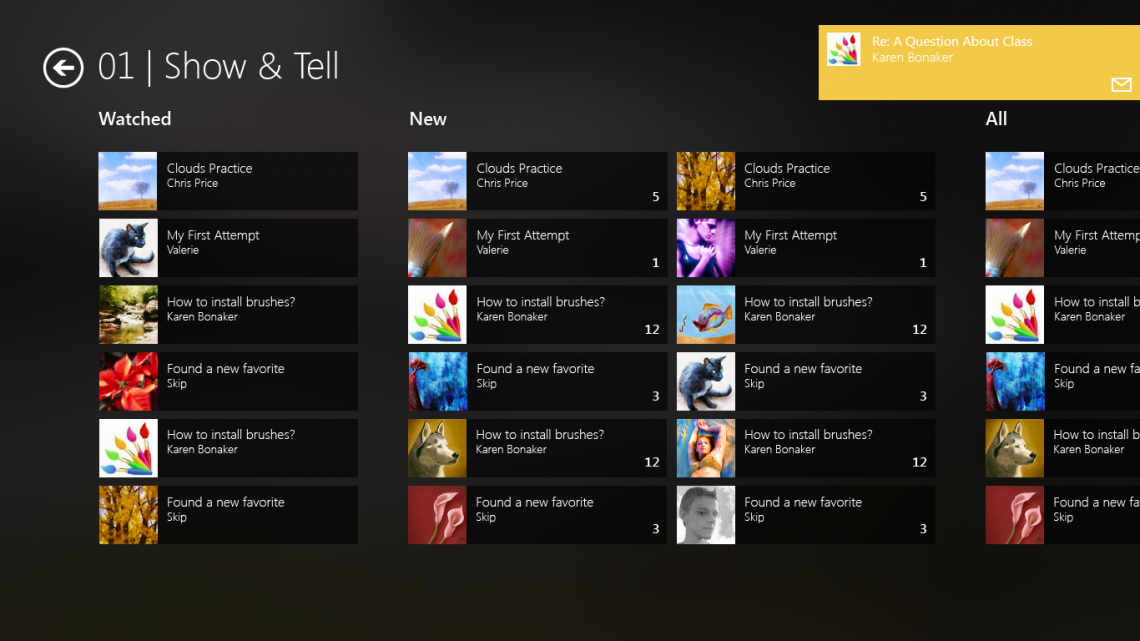
The forums inside of DAA courses are where all of the discussion and sharing of work take place. They are accessed via the Discussion tabs in the weekly course overview screen. In the app, the traditional list of topics is replaced by a tile list showing the title of the thread, the author, number of new replies since the last visit and a thumbnail of the image being discussed (or the avatar of the first post author if no image is uploaded into the topic).
Watched
The Watched group is a student-customizable group that contains topics the student has chosen to follow closely.
New
Topics with new replies since the last forum visit are shown in this group. They are arranged newest to oldest by the last reply by default.
All
As the name suggests, all topics are listed in the All group. They are arranged newest to oldest by the original topic date by default so that the order of topics remains consistent as replies and new topics are posted.
Notifications
This screen also shows an example of in-app notifications that appear in the top right corner of the screen. Notifications can be shown when new private messages are received, course content downloads complete, a watched topic receives a new reply or other important events happen within the app and DAA environment.
Gallery Overview Screen
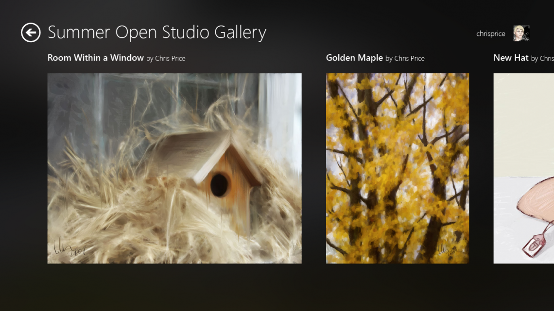
The Gallery overview screen collects all of the large images from the weekly forums for the course for display. As mentioned previously, this is a requested feature from students. It enables students to quickly see what their classmates have worked on throughout the course. Images can also be opened in a single-image, fullscreen view. Context menus provide other navigation options, such as opening the original forum thread for the image.
Gallery Overview Semantic Zoom
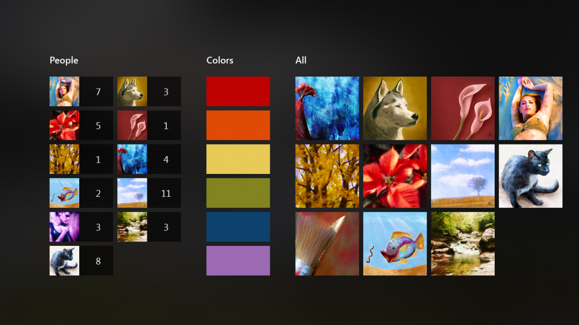
Semantic Zoom is used in the Gallery to allow students to quickly browse through large collections of images either by the original artist, predominant colors, or through thumbnails of the included images. Other metadata from gallery images could be included as a browsing group as well.
Conclusion
The final app design is vastly different from the DAA web interface, but feels right at home in Windows 8. The screens have been slimmed down and place course content easily within the grasp of students… quite literally with Windows 8’s emphasis on touch.
Downloaded course content is available in all situations, so the student is free to unplug from the Internet and learn and paint anywhere. Just imagine relaxing by the lake, watching a few lesson videos and then going straight into Painter or Photoshop to capture the sun setting over the water on a Surface Pro tablet. If it were more than a design comp, Digital Art Academy for Windows 8 would enable exactly that! One can dream.
For credit where it’s due, the pencil, pen and brush icons used on the live tiles were designed by and can be downloaded from Brankic1979.