the Blog
RSS Feed
Inspired by the tooth fairies from Pan’s Labyrinth. The creature design world building in that movie is top-notch.

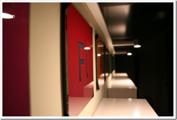
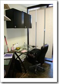
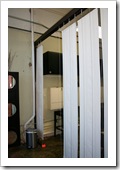
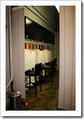
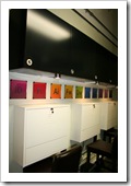
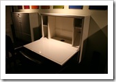
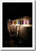
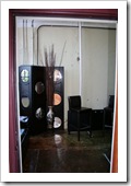
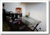
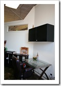
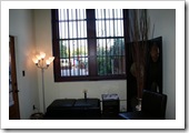
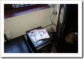
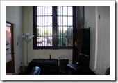
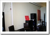
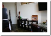
It has been an exciting month and a half getting the new office ready. At this point, all of the major projects (except one that will wait) have been completed and the fun part has started – the decorating! I promised some updated photos, so here they are:
I’ll continue to move into my new, comfy office over time, but at this point, the space is completely ready for me to get started with new projects, courses and private tutoring. It really is exciting!
If any of you are in the Greenwood, SC area and would like to stop by, give me a call or email to set up an appointment and I’ll be glad to show you around! I’ll have my official grand opening on Friday, November 7 as part of Greenwood’s First Fridays. I’ll be in the office from 5pm to 8:30pm giving digital painting demonstrations and tours of the office and the rest of the building. Hope to see some of you there!
140 Maxwell Avenue · Studio 12 · Greenwood, SC 29646
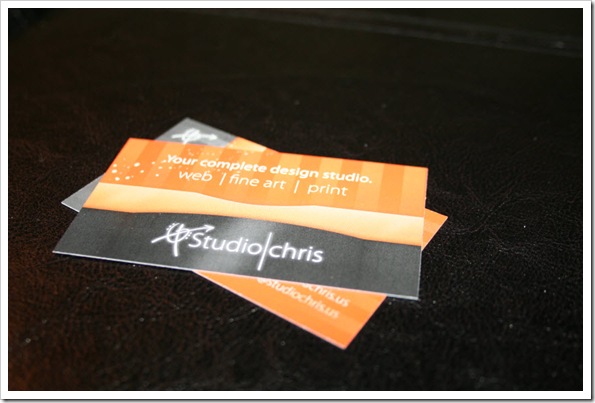
Oh – and one additional note – NEW BUSINESS CARDS!

You’ve heard me talk about it over the last few blog posts, so here are some snapshots taken on October 3, right before leaving for the weekend of seminars, meetings and workshops with Marilyn Sholin at her ASTA Workshop. Of course, since then, things have progressed along nicely, but keeping with the actual timeline of progress, those pics will come later.
At this point in time, some of the furniture was in place, the cabinets were assembled, but only partially hung and the dividing gallery wall was nothing more than a drawing, some cable curled inside a flower urn and some masking tape on the floor. It is fun to look back at some of the beginning stages of this process.
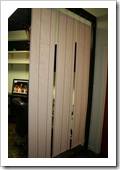
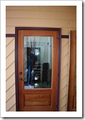
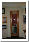
Since it is blurry above, here’s the design on both doors – can’t leave any details out:
The Grand Opening
Coincidentally, the Grand Opening of Meridian was also on October 3. While I would have loved to have been there, as mentioned above, I had to be in Asheville, NC to attend a couple of workshops and teach the Blogging with WordPress for Creative Professionals workshop (the next one is in planning) – details on the workshops coming up!
For a short article on the Grand Opening and Ribbon Cutting Ceremony, check out Greenwood Today.

In the last post, the original measurements were transformed into a working floor plan using a scale drawing created in Adobe Illustrator. Before I post photos, let’s take a virtual walk through of the layout along with some explanation of some of the creative solutions used to maximize the space in the studio.
The Lobby
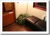
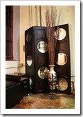
Stepping in through the front door, I established a “lobby” area outfitted with a lamp, a comfy, oversized ottoman with storage inside (the space is small – storage in every nook and cranny is very important to maintain a neat space), a plant for a bit of softness and a small decorative file cabinet, coordinated to my desk, that also serves as a magazine stand and end table. My studio also happens to hold all the utility hookups for the entire building that had to be hidden, so I chose a freestanding screen with circular mirror accents and decorative urn with an 8′ tall natural arrangement to disguise those.

Still following the design and move-in process at Meridian, I left the last post with a very important tip for beginning to design any space – take measurements! So after that, what’s next?
For me, a scale drawing was the next logical step. After taking all of my measurements, I realized the space is smaller than I originally thought, which brought a challenge in which furniture and cabinetry to choose and just how to pull together such a multifunctional space in such a small area. Being a graphic designer, I looked into my digital toolbox and chose Adobe Illustrator (also available in Creative Suite Design Premium) for the task. Sure, it isn’t making a poster, designing a website layout or a great new logo, but Illustrator’s capabilities with precise, scalable measurements makes it the perfect choice for a little impromptu room planning and interior design.

The first step in setting up the new office at Meridian was, obviously, to clear out all the clutter and transform the space from a storage closet into a usable room. Luckily, I didn’t have to be involved in that process, but I did start working before everything was cleared out. You may be asking, “What were you able to do with all that stuff in there!?” The answer is… not much, but at the same time, probably one of the most important jobs in preparing the space – measuring everything.
The studio isn’t huge, so good measurements were the key in being able to plan everything out. I’ll admit, it was tough climbing over all the obstacles, but the end result was everything I needed to begin.
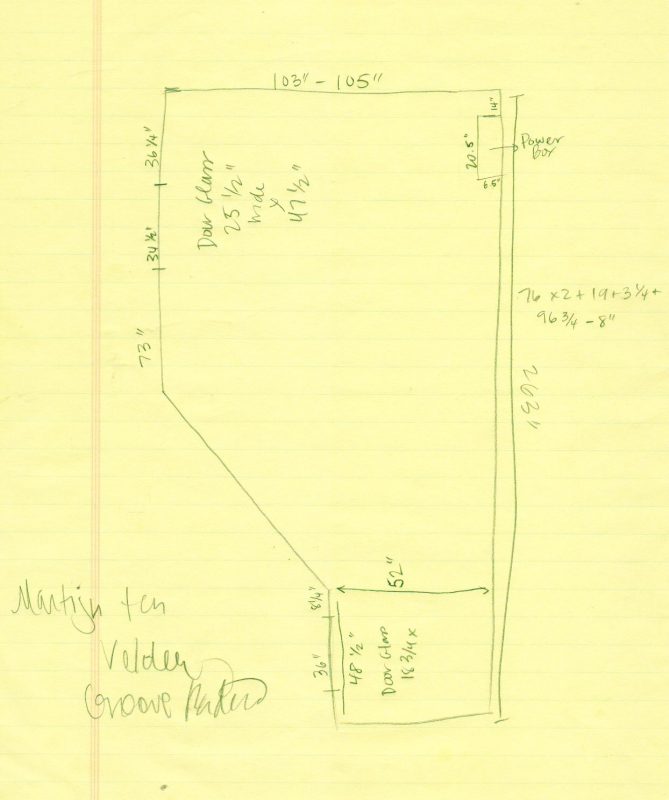
Of course, the initial drawing wasn’t to scale, but the drawing (and the random scribble taken from my radio listening) isn’t the important part – the measurements are. The drawing helps to visualize the different measurements and how they relate to the shapes of the room, though. I wasn’t able to reach the angled wall, but no worries, the scale drawing to come later filled in that measurement for me quite painlessly.
Note to all who are designing a studio space inside of an existing room – take accurate measurements! The space may appear larger than it actually is, which became my first roadblock.

