the Blog
RSS Feed
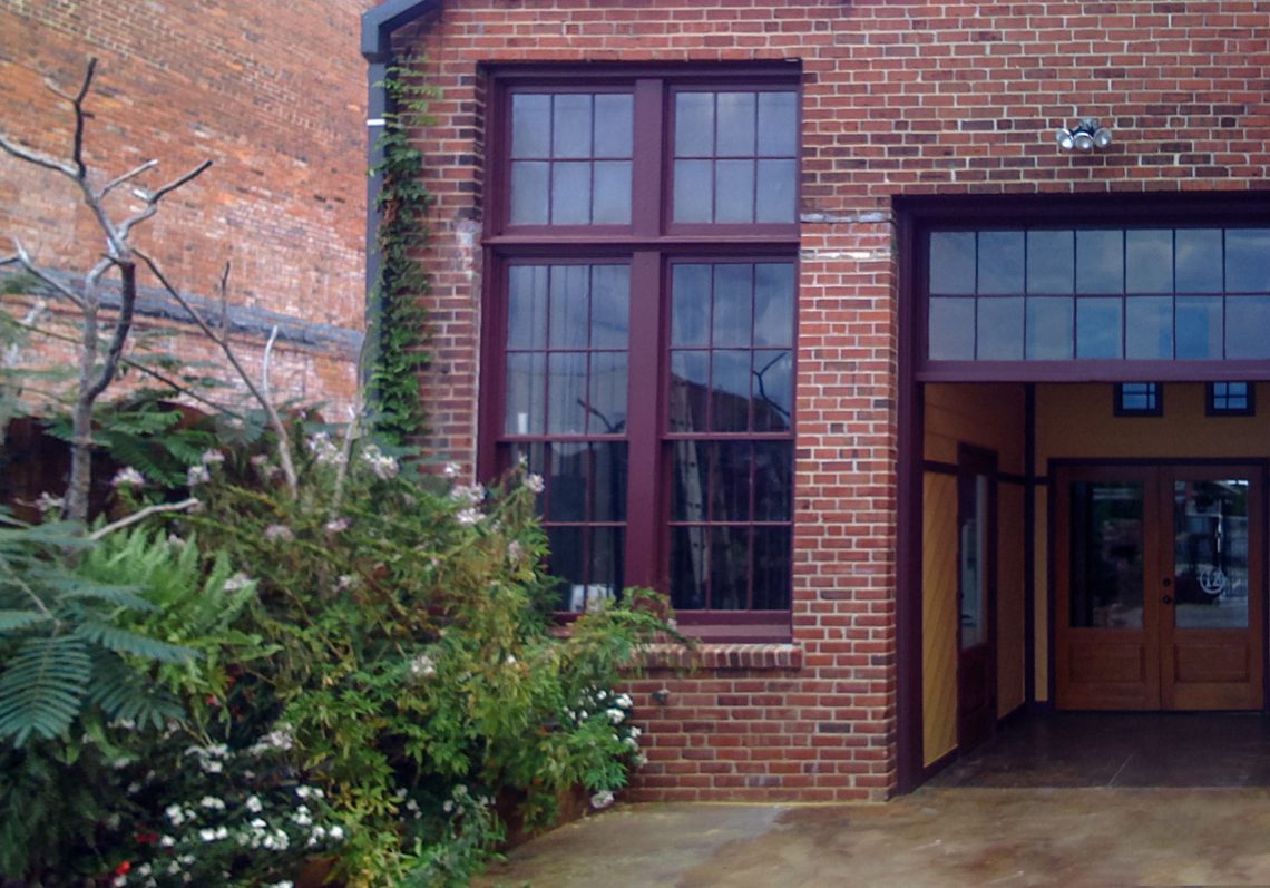
It is official – Studio|chris is opening a physical office location in Greenwood, SC! This is a HUGE step and I’m happy to be able to share it with all of you!
The brand new office is inside of a building named Meridian at 140 Maxwell Avenue. The space was established as 12 studio spaces for artists, and I was lucky enough to be able to pick up the last remaining studio in mid-September. Since then, thing have been a mad dash to equip the studio with furniture, cabinetry and all the other necessities to create both an office, gallery, meeting space, and a small classroom for private tutoring in all of the Adobe Creative Suite applications and Corel Painter X
.

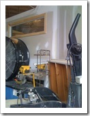
So let’s take a look back to September 15, 2008 (pics courtesy of the iPhone):
 |  |  |
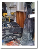 | 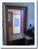 | 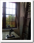 |
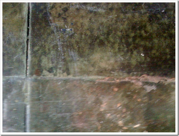
The space was being used as a storage closet for the building. Lots of miscellaneous tools, hardware, appliances and decor was scattered absolutely everywhere! Even though it was packed to the ceiling with stuff, I knew this studio was special and would become the home of Studio|chris. Although a little blurry in the photo, take a look at this fabulously aged concrete floor:
Over the next few days, I’ll be posting a series detailing the move-in process, all the events that took place after the room left its storage closet past behind and a few details about the building and my new neighbors!
I’ll also take a little time between posts to catch up on some of the events that have taken place, outside of the office, in the past month – including the awesome weekend of workshops with Marilyn Sholin.

It has been 7 long years (and a couple months) since the release of Internet Explorer 6, along with its many rendering bugs. Some of these were fixed in IE7, and even more are fixed with the forthcoming IE8. With that said, watching the stats of visitors to this site, over 90% of you have upgraded to IE7 or other, newer browsers. At this point, I’m officially dropping support for IE6 for this site, except for problems that affect usability. This doesn’t change much for the current design, which I’m planning on sticking with for a while because I love it, but future designs and improvements to this design may not display perfectly in IE6.
Unlike some sites taking a stand against IE6, I will not block IE6 from viewing the site, but just be aware that some parts may not display perfectly if you’re using IE6. All the different pages and content will be available – the drop of support is completely aesthetic in nature. Hacks will no longer be used to make sure everything is displays perfectly in IE6.
To be sure you’re seeing this site (and others) as intended, please consider upgrading your browser. Here are some recommendations:
What Does This Mean For Clients?
With dropping support for IE6 on the Studio|chris site, I will also be dropping out of the box support for IE6 on any future or yet to launch client projects. IE6 display support may be added on for an additional fee, if needed. Once again, sites WILL display and be usable for IE6 users, they just may not display 100% as they do in a more standards compliant browser, like Firefox, due to the rendering engine bugs. Ultimately, this decision was made instead of raising prices across the board due to the growing amount of extra time (sometimes measured in days) spent to “fix” sites for IE6.
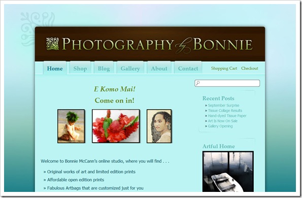
I met Bonnie McCann of Photography by Bonnie a long time ago through the Digital Painting Forum. She lives in paradise in Kaneohe, HI which is literally a hop, skip and a jump from Honolulu. Given her location, Bonnie does a lot of tropical themed art and her photography ranges through nautical, aquatic, tropical and cultural themes. Stunning work – in fact, so stunning that she recently won the Grand Prize in the Artful Home’s 2008 Portfolio Competition!
In conjunction with her accomplishments, Bonnie decided it was time to toss out the old Flash template website she had been using in favor of a more classy and elegant interface that she could update quickly and easily and also included a blog and shopping cart system to sell her products online. In her list of requests for the new look was the light cyan that makes an appearance as the main content background color, a slight tropical feel (but remaining elegant) and to keep things as open as possible.

Bill Keane, owner of Keane Studios, LCC, heard me speak at WPPI back in March of this year when Marilyn called me up on stage during her program in the Silver Ballroom at Bally’s (I should really write about that sometime – it was an awesome experience!). After the conference, Bill contacted me to totally revamp his online presence. Bill’s old site was very simple, and according to him, didn’t really suit the “look” he’d like to put forward for his studio. He also wanted to be able to take advantage of blogging, which he wasn’t able to on his old site.
Bill’s requirements were for customers to be able to order portrait sessions on the site and we were to make use of his “signature green” and current logo. Along with the signature green, we also introduced a brand new green – the lighter green that serves as the background (I believe it was called Wasabi). Bill was great during the design process, providing color swatches, paper design patterns and samples of other websites he liked. Combining this all together, the final look combines the colors, logo, textures, and all of the other provided suggestions into a designed based on layered arcs, stripes and slightly textured backgrounds.
I recently had the pleasure of working with local artist Alice Rambo on the starter site for her new venture, Splash Designs. This is my third project with Alice. Previously, I’ve helped her create her logo, business cards and and an identifying flyer. All of them, if I say so myself, have turned out great, and Alice has been thrilled.
For her beginning website, Alice didn’t need anything very complex. She basically wanted something that introduced her to the community along with a few samples of her paintings. With her love of color and spontaneity, we started with a vibrant background taken from one of Alice’s abstract paintings, which matches the styling of one of the accent walls in her studio. On top of it, we’ve added various design elements taken directly from her business cards and other marketing materials along with her splashy logo and several paintings chosen by Alice.
Business Cards
Before the website, as mentioned above, Alice commissioned her business cards with the idea that they should be “fun” and have some representation of a splash to accompany her business’ name. Sure, we could have done a traditional paint splat, but that wouldn’t fit Alice’s larger than life personality. During an in-person consultation, we came up with a conceptual “splash” that does bring in some specks of a normal paint splash, but adds so much more with swirls and modern flourishes.
The end result is a card designed in Adobe InDesign CS3 for traditional one-color printing. For her first round, Alice chose to use a lively aqua-cyan ink (which ties into the color of her website background), and they look fabulous printed on a double-sided glossy card! She really likes the fact that as the blue cards begin to run out, or if she’s ready for a quick change, she can just have another batch printed in another color to keep things nice and fresh.

↑ Logo Side | Information Side ↓

The much awaited Blogging with WordPress for Creative Professionals at the ASTA workshop is coming up very soon (October 3 & 4)! This is going to be an awesome two days all about online marketing through blogging – and with attendees flying in from all over the country, you can bet it is going to be good!
As part of a marathon of workshops in the beginning of October, the evening before the blogging workshop (October 2 – 6-9pm), Alyson B. Stanfield, the Art Biz Coach, and author of I’d Rather Be in the Studio! will be giving a one night only workshop designed to “give you inspiration and motivation, along with ideas that you can use to promote yourself and sell more art.” For more information, go have a look at Alyson’s introduction to the program. ONLY 2 SEATS LEFT!
Directly after the Blogging Workshop (October 5 – 7), Marilyn has scheduled a Beginner’s workshop for Corel Painter – the Fall Painter Blast. This one is going to be a lot of fun (and is already sold out).
Registration for both open events is available in the Digital Painting Shop – limited spots left, so run over and make your reservation before the seats run out!

This Fall, Chris of Studio|chris will team up with Marilyn Sholin at the ASTA workshop to give a very special workshop on blogging in beautiful Asheville, NC! Come experience the fall colors, fresh autumn air and learn from two passionate speakers on the subject of blogging and promoting yourself through online channels.
The workshop will be open to 14 students and will cover all aspects of blogging, from start to finish, using the WordPress blogging platform. We’ll also cover how to integrate your blog with your current website (or link to your new blog from your website), if you have one, and how to get a website if you don’t have one already. By the end of the workshop, all attending will have an awesome blog to use for marketing, online journaling, and keeping the world up to date on your art! Take advantage of this fabulous marketing platform.
Workshop Basics:
- Dates
- October 3 & 4, 2008
- Pricing
- $299
- Includes the workshop, one-on-one time with Chris, breakfast & lunch on both workshop days and light refreshments.
- Suggested Prerequisites
- A web hosting plan that supports PHP & MySQL (capable of running the WordPress software). If you’re unsure if your current web hosting provider offers this, contact Chris with the name and web address of your host. Those without hosting plans may participate in the workshop as well – there are options!
Registration open now at the Digital Painting Shop.
UPDATE: The Studio|chris Brush Installer has been discontinued and is now the Studio|chris Brush Manager. This post exists only as an archive. The integrated installer and download links for the Brush Installer have been changed. To install the new, free Brush Manager software, visit the Brush Manager’s main page.
Behind the scenes, I’ve been working on the next version of the Studio|chris Brush Installer. The 0.6 beta branch will bring a lot of changes and increased functionality. A release date hasn’t been set, but here’s what to look forward to!
A New Interface
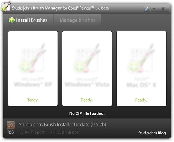
The first thing you’ll probably notice is a new interface that is customized especially for the application. Things are still as simple as the original as far as installing brushes – simply drag and drop your brush ZIP file on your OS box and the installer takes care of the rest.
The new interface is standardized over all operating systems, so Windows and OS X users will see the exact same interface. The screenshot below isn’t complete, but is a working prototype of the new interface.
A New Name
With the next release, the Studio|chris Brush Installer will become the Studio|chris Brush Manager. The Brush Installer name is going away in the next version for two very good reasons:
- Documentation Confusion: “Have you installed the installer correctly using the install button on the website?” Yeah, I’m scratching my head too and I wrote the thing! The new Brush Manager name will help avoid this type of confusion.
- New Features: The new feature set for the application really expands the application to be more than just an installer, so the new name encompasses those new features and also future improvements.
The new name is set in stone for the foreseen future of the application.
A New Feature Set
I mentioned some new features in the previous section. Here are some of them:
- Settings panel accessed by clicking the new Settings button (wrench icon) in the title bar. That messy Vista UAC checkbox is going in there with a lot of other options.
- Install brushes to Painter 7 through Painter X.1, even if you’ve customized the location of the Painter Brushes folder (ie. “I install all of my applications to D drive instead of C drive.”). This will also bring support to Windows Vista 64-bit. Thanks Les and Sue.
- Automated updates, not to be confused with automatic updates. Updates will no longer require visiting the website to install the new version. For updates to 0.6 and beyond, just open the settings panel and click the update tab to check for and install updates.
- The new Manage Brushes tab (will not be active in 0.6) contains functions to backup, delete, deactivate and reactivate brush categories. The Manage Brushes tab will become active in version 0.7 for users who wish to purchase an upgrade package. The Install Brushes tab will always remain free.
- In the background, and included as part of the new settings, you may choose to activate “logging” to log where files are being placed while using the Install Brushes tab. This will be useful in troubleshooting.

Surely this was just a camera misfire, but when rotated, it reminds me of a busy subway platform.


