Design & Dev
Sarah Drasner tweets about Vue.js and other web development and design topics.
AppJS is no longer being updated or maintained. For a similar platform, check out node-webkit which is backed by Intel Open Source and is consistently being improved and updated. I’ll write a new tutorial for node-webkit sometime in the future. Also, despite the legacy name, node-webkit uses Chromium as its base, so it is now using the Blink rendering engine.
Over the past few months, I’ve been studying up and trying out several cross-platform development solutions and one of the more interesting ones I’ve found, as a web designer and developer, is AppJS. It allows development for the desktop for all three major desktop operating systems using the mix of technologies commonly known as HTML5 and node.js.
Of course, I’ve also been using Adobe AIR since it was introduced, though AIR for HTML isn’t all that great in my experience. AppJS, on the other hand, uses the Chromium Embedded Framework which renders content beautifully, is super fast and has all of the latest and greatest features HTML5 has to offer without awkward workarounds.
Before getting started, it is worth mentioning that AppJS is still a relatively new project and documentation is sparse at the moment, but it is being worked on. I’m also not attempting to compile and package a completed app just yet, so I will be using the distributable version and replacing the content files throughout this tutorial.
CSS3 support in browsers is bringing some exciting changes to web design and what is possible without jumping into Photoshop to make images and gradient backgrounds. During the redesign of studio|chris, I decided to take advantage of some of the new techniques for some of the buttons around the site.

For AIR applications that have access to an internet connections, delivering ads via OpenX is very easy with just a little code. For this basic implementation, we’ll use AIR’s built-in WebKit browser, which accepts JavaScript delivery perfectly, by using an instance of the HTMLLoader class. This is the same approach I’ve taken with my own AIR application, Brush Manager, which is authored in Flash CS4 Professional. Being completely ActionScript based, the same code should be able to be used in the Flex environment (maybe with very few modifications for public and private identifiers). HTML/JavaScript based applications should be able to use a similar approach, if the ads aren’t already integrated completely into the code base for the app.

It has been 7 long years (and a couple months) since the release of Internet Explorer 6, along with its many rendering bugs. Some of these were fixed in IE7, and even more are fixed with the forthcoming IE8. With that said, watching the stats of visitors to this site, over 90% of you have upgraded to IE7 or other, newer browsers. At this point, I’m officially dropping support for IE6 for this site, except for problems that affect usability. This doesn’t change much for the current design, which I’m planning on sticking with for a while because I love it, but future designs and improvements to this design may not display perfectly in IE6.
Unlike some sites taking a stand against IE6, I will not block IE6 from viewing the site, but just be aware that some parts may not display perfectly if you’re using IE6. All the different pages and content will be available – the drop of support is completely aesthetic in nature. Hacks will no longer be used to make sure everything is displays perfectly in IE6.
To be sure you’re seeing this site (and others) as intended, please consider upgrading your browser. Here are some recommendations:
What Does This Mean For Clients?
With dropping support for IE6 on the Studio|chris site, I will also be dropping out of the box support for IE6 on any future or yet to launch client projects. IE6 display support may be added on for an additional fee, if needed. Once again, sites WILL display and be usable for IE6 users, they just may not display 100% as they do in a more standards compliant browser, like Firefox, due to the rendering engine bugs. Ultimately, this decision was made instead of raising prices across the board due to the growing amount of extra time (sometimes measured in days) spent to “fix” sites for IE6.
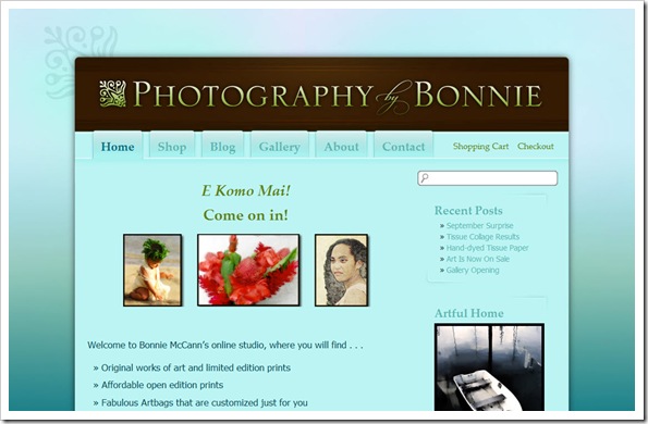
I met Bonnie McCann of Photography by Bonnie a long time ago through the Digital Painting Forum. She lives in paradise in Kaneohe, HI which is literally a hop, skip and a jump from Honolulu. Given her location, Bonnie does a lot of tropical themed art and her photography ranges through nautical, aquatic, tropical and cultural themes. Stunning work – in fact, so stunning that she recently won the Grand Prize in the Artful Home’s 2008 Portfolio Competition!
In conjunction with her accomplishments, Bonnie decided it was time to toss out the old Flash template website she had been using in favor of a more classy and elegant interface that she could update quickly and easily and also included a blog and shopping cart system to sell her products online. In her list of requests for the new look was the light cyan that makes an appearance as the main content background color, a slight tropical feel (but remaining elegant) and to keep things as open as possible.
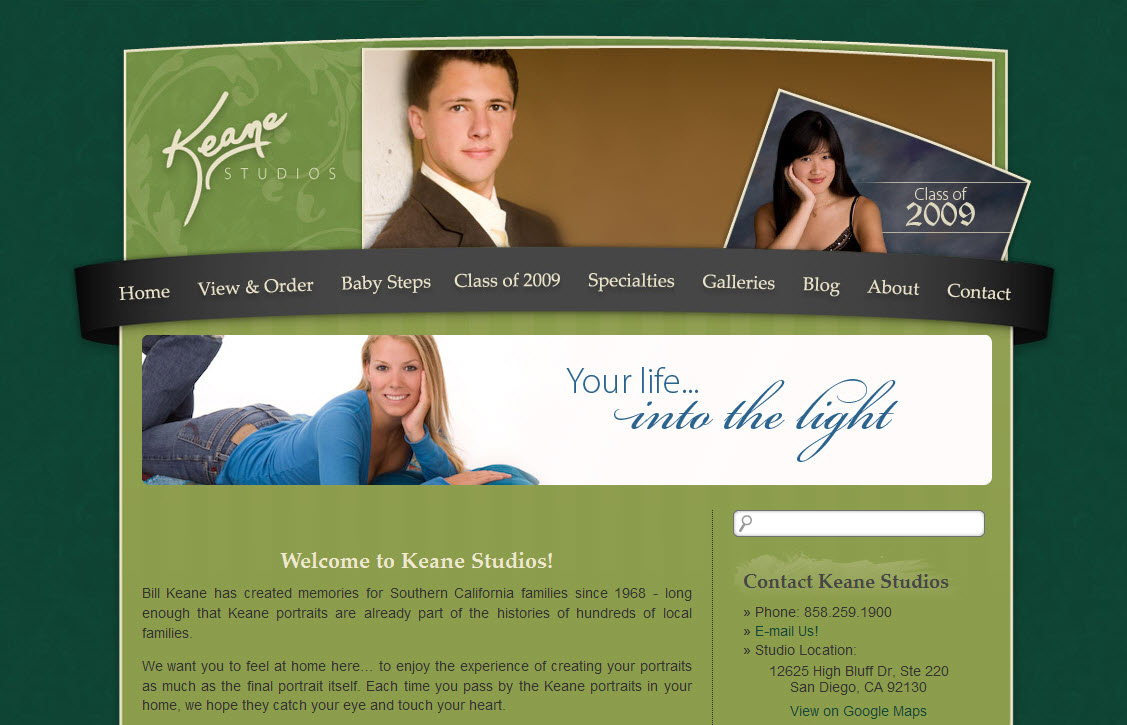
Bill Keane, owner of Keane Studios, LCC, heard me speak at WPPI back in March of this year when Marilyn called me up on stage during her program in the Silver Ballroom at Bally’s (I should really write about that sometime – it was an awesome experience!). After the conference, Bill contacted me to totally revamp his online presence. Bill’s old site was very simple, and according to him, didn’t really suit the “look” he’d like to put forward for his studio. He also wanted to be able to take advantage of blogging, which he wasn’t able to on his old site.
Bill’s requirements were for customers to be able to order portrait sessions on the site and we were to make use of his “signature green” and current logo. Along with the signature green, we also introduced a brand new green – the lighter green that serves as the background (I believe it was called Wasabi). Bill was great during the design process, providing color swatches, paper design patterns and samples of other websites he liked. Combining this all together, the final look combines the colors, logo, textures, and all of the other provided suggestions into a designed based on layered arcs, stripes and slightly textured backgrounds.
I recently had the pleasure of working with local artist Alice Rambo on the starter site for her new venture, Splash Designs. This is my third project with Alice. Previously, I’ve helped her create her logo, business cards and and an identifying flyer. All of them, if I say so myself, have turned out great, and Alice has been thrilled.
For her beginning website, Alice didn’t need anything very complex. She basically wanted something that introduced her to the community along with a few samples of her paintings. With her love of color and spontaneity, we started with a vibrant background taken from one of Alice’s abstract paintings, which matches the styling of one of the accent walls in her studio. On top of it, we’ve added various design elements taken directly from her business cards and other marketing materials along with her splashy logo and several paintings chosen by Alice.
Business Cards
Before the website, as mentioned above, Alice commissioned her business cards with the idea that they should be “fun” and have some representation of a splash to accompany her business’ name. Sure, we could have done a traditional paint splat, but that wouldn’t fit Alice’s larger than life personality. During an in-person consultation, we came up with a conceptual “splash” that does bring in some specks of a normal paint splash, but adds so much more with swirls and modern flourishes.
The end result is a card designed in Adobe InDesign CS3 for traditional one-color printing. For her first round, Alice chose to use a lively aqua-cyan ink (which ties into the color of her website background), and they look fabulous printed on a double-sided glossy card! She really likes the fact that as the blue cards begin to run out, or if she’s ready for a quick change, she can just have another batch printed in another color to keep things nice and fresh.
↑ Logo Side | Information Side ↓
