Artists

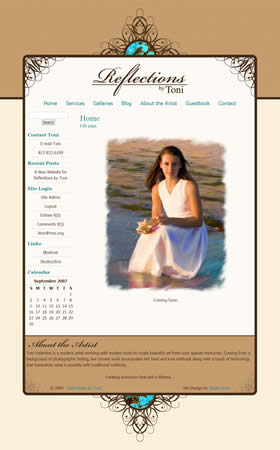
It’s that time once again. Another successful client site launch. Reflections by Toni, owned by Toni Valentine, offers portrait painting and photography services. Her work is timeless and classy, and as such, she wanted a website design that would convey those same feelings.
She admitted to me that she likes “cutesy” and whimsical, and she usually adds these elements to her clients’ proofs in the form of borders. As a result, we moved in that direction for her site by exploring custom made borders to use for the site that would effectively become branding elements for her Reflections by Toni brand. The main website border is the result of our efforts. It combines whimsical swirls presented in an elegant, symmetrical fashion with a touch of color in the turquoise accents that pull in some common colors from her paintings. The final result is a website that has an elegant look and complements her work flawlessly. Also included in her package was a set of borders specifically for use on her client’s proofs. By combining the site and these brand-new custom borders, the Reflections by Toni brand will surely begin to manifest itself in her clients’ and potential clients’ minds.
On another note, not related to the design, Toni had concerns of being totally in control of her own website, without having to spend hours and hours to update content or have to worry about the design or coding of newly created pages. Of course, I had an answer to that! Toni is set up on an adapted content management system that keeps everything super simple for her to control and update, and not have to worry about the design aspect because it has already been done! Keep your eye on the Studio|chris Shop for these setups to become available in the coming days. Until next time – back to designing!
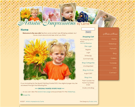
Studio|chris recently wrapped up a fabulous new web site for digital artist, Carrie Woeck. Carrie’s initial web site was a single page site created by Studio|chris to showcase her wonderful sports painting painting tutorial, but after some time, she decided she was ready for a full web site. Soon after her initial contact, we were on our way to the finished product.

Designing for an artist can sometimes be difficult, because in the end, the design has to match the personality and work of the artist while at the same time not overpowering the artist’s work. Carrie’s final design pulls from colors that are prominent in many of her paintings and reflects both her personality and the fun and modern medium she works in. The design also brings her work to the front with a header including some of her wonderful paintings. At the beginning of the process, she was a little worried the background pattern would be too busy [we even went through a couple of color scheme changes] but her concerns were laid to rest as soon as all the elements started coming together and the original color scheme was the winner! In the end, she has a wonderful new site to show off her work and is very happy with the final outcome.
Visit Carrie’s new site!
Coincidentally, Carrie’s new site also marks the beginning of an exciting new line of web design products for the Studio|chris Shop. These will debut in mid-September. I’ll be posting a teaser in the September issue of the Digital Ink Newsletter, be sure to subscribe to get yours as soon as it is sent out!