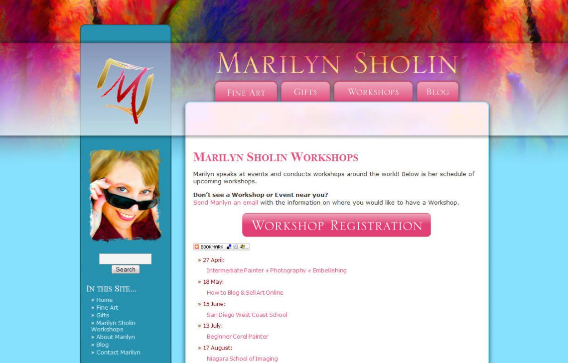
Client Website Launch: MarilynSholin.com

As all of you know by now, Marilyn and I work exceptionally well together, and as a result, we work together often. When Marilyn was ready to update her branding with a wonderful logo created by Charmaine Check at Check Studio, she came to me. The goal was for something refreshing, new and “Marilyn.” My first instinct was pink all over the place because Marilyn loves pink. It is a color that’s in all of her paintings, in every piece of marketing material I’ve seen from her, and of course the color she chooses to use as her daily skin color over at the Digital Painting Forum.
The first concept for her site is the same as above, but only in a rich set of pink and burgundy. She loved it, but always having had pink as a central color, decided it was time for a little change, something fresh. We played around with color palettes from a paint catalog (color inspiration is everywhere) and chose to keep pink as a strong accent, but opted for the blue and teal for the base design’s background. To make it more “Marilyn,” we used one of her most popular paintings [Bourbon Balcony] for a splash of color in the header.
The result is a contemporary, layered design that meets all of the goals we set out to accomplish. Now if only she could slow down enough so we can sit down and finish filling in all the content! Not to worry though, we have it on our to-do lists [along with plans for more expansion]. An artist’s work is never done!