Design & Dev
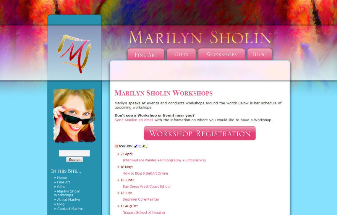
As all of you know by now, Marilyn and I work exceptionally well together, and as a result, we work together often. When Marilyn was ready to update her branding with a wonderful logo created by Charmaine Check at Check Studio, she came to me. The goal was for something refreshing, new and “Marilyn.” My first instinct was pink all over the place because Marilyn loves pink. It is a color that’s in all of her paintings, in every piece of marketing material I’ve seen from her, and of course the color she chooses to use as her daily skin color over at the Digital Painting Forum.
The first concept for her site is the same as above, but only in a rich set of pink and burgundy. She loved it, but always having had pink as a central color, decided it was time for a little change, something fresh. We played around with color palettes from a paint catalog (color inspiration is everywhere) and chose to keep pink as a strong accent, but opted for the blue and teal for the base design’s background. To make it more “Marilyn,” we used one of her most popular paintings [Bourbon Balcony] for a splash of color in the header.
The result is a contemporary, layered design that meets all of the goals we set out to accomplish. Now if only she could slow down enough so we can sit down and finish filling in all the content! Not to worry though, we have it on our to-do lists [along with plans for more expansion]. An artist’s work is never done!
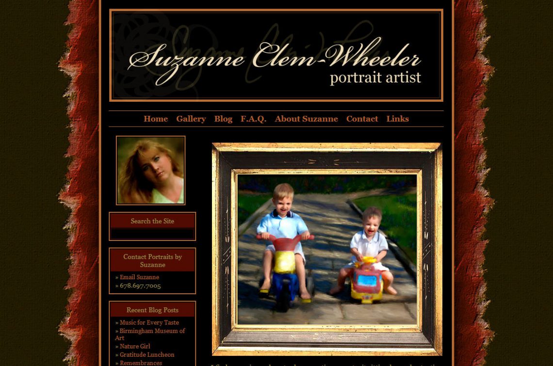
Suzanne is a portrait artist from the Atlanta, GA area who uses modern digital tools to create one-of-a-kind portraits for clients. I met Suzanne for the first time a few years ago at DigitalPaintingForum.com and over that bit of time, we’ve built an online friendship as well
As a little bit of history for Suzanne’s site, a little over a year ago, Suzanne was one of Studio|chris’ first clients. For the first iteration of her site, we worked together to create a static HTML site that effectively represented her brand; however, since it was all HTML updates were a little complicated.
Her host at that time offered a blog engine, so she did maintain a blog as well, but due to limitations set by the host, the look could not match her site. This wasn’t good from a branding standpoint because as her site visitors navigated around, if they clicked on her blog, they went from the richly colored, jewel-toned site to her blog which was tan and white. The blog, though on the same domain name, was like an entirely different planet from her main site. This can be confusing to users as they wonder if they’ve left the site they were viewing or not.
As a solution to those two problems, the new SuzanneClemWheeler.com now uses a customized WordPress-based system to manage her entire site, which makes her content simple to update and brings her blog into her site with a consistent look and feel. She decided to maintain the same look as her old site with a few minor changes, and it still works beautifully. With her new site in place, Suzanne is ready to take the world by storm with her portraits.
The following ten questions have been asked by Studio|chris readers over the past few months.
Blogger, Blogsome, Blogspot or WordPress.com? What is the difference in them?
As professionals, the differences in the above do not matter because they all impose limitations on the type of content you can post without fear of your blog being deleted for misuse. As free blog hosts, the terms of all of these do not allow for selling work directly on your blog. The alternative is to use WordPress or any other blogging software installed on your own web server. This removes all the limitations, and you can use the software for absolutely anything you want to, including all of the features of the free blog hosts and adding in the ability to add plugins for more functionality, sell your work, and customize to your heart’s content!
If I have a website, why do I need a blog too?
Blogs are constantly growing as a way to get the word out about your art and what you do. Businesses are taking advantage of this wave of popularity and are using blogs for a number of reasons. To name just a few: a blog can help add a personal side to your business which can help build customer relationships, improve the customer experience, help establish you as an expert in your field, open your site to new search engines, tap into a user base of billions of people, make regular search engines visit your site more often for updates, and give you an easy platform to publish content (even outside of the blog area!). Even with those few, having a blog is worth more than its virtual weight in gold!
No one ever comments on my blog. Am I wasting my time?
Comments are only one part of a blog. Just because no one is commenting doesn’t mean people aren’t reading and taking notice. Regardless of comments, having a blog also opens up a whole new world of search engines – blog searches which may bring more visitors to your site and may help increase sales! As an artist, you should give as many people as possible the chance to see your work, even if they don’t make comments in the blog.
After the last redesign, I never imagined yet another redesign so soon, but with a few comments from visitors, I have to agree that it is that time again. The new design is a huge update and puts the focus where it should be — the content! Here’s a sneak peek of the new design:
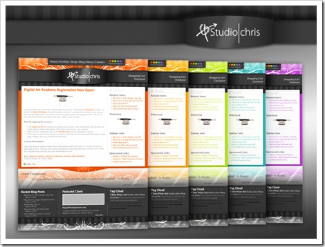
I don’t have a release date set, and likely won’t set one, so it’ll be a surprise when the new look pops up! This is a very exciting update here, and my thanks go out to those who have watched through the progress of and commented on the initial design on the Digital Painting Forum and Painter Talk.
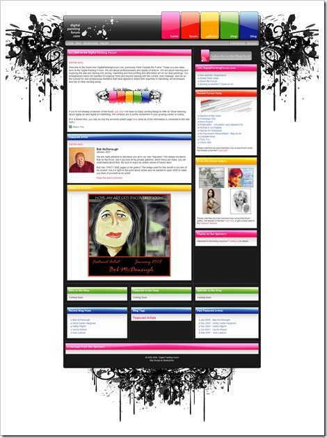
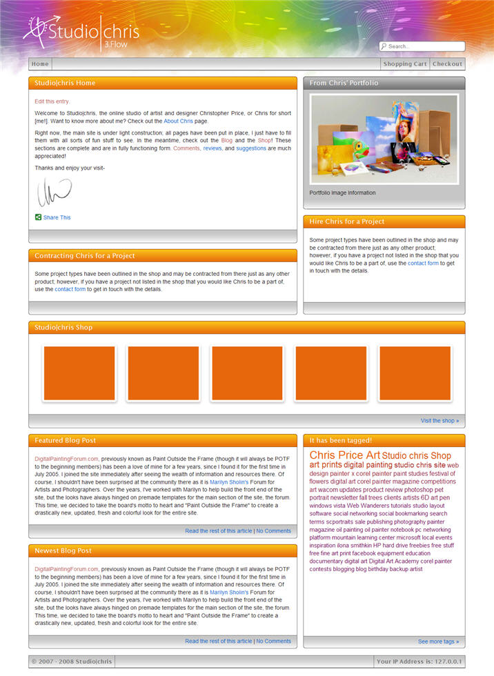
DigitalPaintingForum.com, previously known as Paint Outside the Frame (though it will always be POTF to the beginning members) has been a love of mine for a few years, since I found it for the first time in July 2005. I joined the site immediately after seeing the wealth of information and resources there. Of course, I shouldn’t have been surprised at the community there as it is Marilyn Sholin’s Forum for Artists and Photographers. Over the years, I’ve worked with Marilyn to help build the front end of the site, but the looks have always hinged on premade templates for the main section of the site, the forum. This time, we decided to take the board’s motto to heart and “Paint Outside the Frame” to create a drastically new, updated, fresh and colorful look for the entire site.
The preliminary design was a lot more simple, elegant with rounded corners and began to establish an artistic color theme for the site’s construction, but deep into the project, after pulling in many of the new elements into a test site we decided the entire look was a little less than spectacular (BORING!). So, I hit the drawing board once again trying to figure out a way to bring some punch and wow into the new design, while staying within some of the initial guidelines we had established. This happened only THREE DAYS prior to the scheduled unveiling, which took place on January 1, 2008! Not to fear though, we did unveil the most important section of the site on time, and with 5 colored skins, no less. The remainder of the site’s construction took place over the next week which is where we are today.
So far, the member’s response has been positive, and I am really happy with the way the site has turned out. Marilyn and I do have a couple of other sections to add and reformat to the new look, but those will come soon as some final bits of information pulled together. For now, I’d call the project a complete success. The Digital Painting Forum has a new look with lots of color and fun. The site will continue to grow as new plans are rolled out, and I, for one, am in love with the site even more and am very happy to be a part of the Digital Painting Forum team.
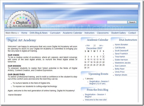
Digital Art Academy (DAA) is set to be the next generation in digital art training. I was contacted by the owner of DAA, Karen Bonaker, very early in its life with an invitation to become one of the original instructors. As noted in my previous DAA post, I will be teaching the Adobe Illustrator courses at DAA with the first session (and course level, Illustrator I) opening for registration on January 18, 2008 with the first day of class being February 18, 2008. With each successive session, another level of Illustrator will be added until four levels are available. All four of these core courses will be offered as 4-week sessions and cost $32 per session. Also, in the mix are a couple of Creative Illustrator courses that will focus on specific disciplines with using Illustrator as well as Electives that present very specialized training and even more creative avenues. Now, on to the website!
The site itself is composed of a lot of different environments unified by common design elements. For each of the different environments to complete the academy (front end site, blog, and learning management system and forum), it was very important to maintain a consistent look and feel throughout. The typography and graphics from the front-end site were used and flow throughout all of the different environments to maintain and establish the original branding for Digital Art Academy. The final overall feel is soothing and dynamic at the same time with cool blues sweeping through the header and site with punches of color in the custom, versatile logo.
The idea of the site was to create a site with a professional presence along with little bits of creativity sprinkled in to keep the site fun. Finding the delicate balance of professional and widely appreciable and fun and creative was a little difficult to achieve in the beginning of the project because the original logo had a really digital feel using a pixelated font. At Karen’s request, the logo was changed to include the smooth, fluid font it holds now. I believe it helps soften the site as a whole, and in the end, the design is something both Karen and I are extremely happy with.
For now, the site has been released to the staff of DAA to fill in the remaining content, but do go have a look. The course offerings will be awesome and varied with some of the most talented instructors in the field of digital art. I look forward to seeing you all there!
